
What a Rebranding Actually Requires: Diagnosis, Blueprint, Precision
Most rebrands fail before the design begins — because no one read the brand first. This is the diagnostic and surgical framework we use at Branding Confidential to separate what gets kept, what gets evolved, and what gets removed. With a real case study.
Sophie O.P.
4/14/20267 min read

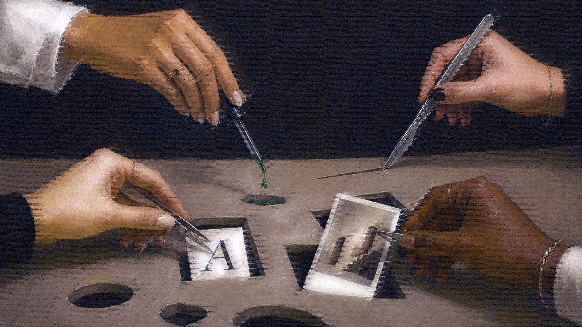
A surgeon doesn't walk into the operating room and start cutting.
Before the operation, there is a scan. Before the scan, there is a symptom. Before the symptom is named, someone has to sit with the patient long enough to hear what they're actually describing: not just what they think is wrong, but what the body has been compensating for without anyone noticing, and for longer than they'd care to admit.
A good architect does something similar before a single wall comes down. She reads the building first, traces the load, finds what's holding everything else up. The thing you cannot remove without consequence. The thing that looks decorative but has been carrying weight for years.
Rebranding, done correctly, is both of these things at once. A diagnosis before it is an operation, a blueprint before it becomes a build. The brands that come out of it intact, the ones that evolve without erasure and change without losing themselves, are the ones where someone insisted on that sequence. Where the reading came before the redesign. Where the question was never "what should this look like?" but "what is this brand actually made of, and what has it been compensating for?"
This is how we work. And this is what most rebrands skip.
What we hear in every discovery call
There's a pattern in the conversations we have with founders who are considering a rebrand. They describe their brand the way someone describes a room they've lived in too long: familiar to the point of invisible. They know something is off, but they've stopped being able to see it clearly.
The language is almost always one of three things:
"We've outgrown it." This one is usually accurate, but it rarely means what they think. The brand didn't stop working because they grew. It stopped working because it was built to reflect a version of the business that no longer exists, and nobody updated the architecture as the building went up. You've expanded your offer, raised your prices, started working with a different kind of client. The brand is still introducing you as the person you were three years ago.
"It doesn't look premium enough." Almost always points somewhere deeper. When a brand reads as less premium than the actual product, the problem is almost never the logo. It's a coherence failure: the product has evolved, the client has evolved, and the visual language hasn't kept pace. The gap isn't aesthetic. It's structural. Your clients sense something is off even when they can't name it, and that sense is costing you before a single conversation begins.
"It doesn't feel like us anymore." The most honest version, and also the hardest to work with, because "feel" is not a brief. But it's almost always pointing at something real: the brand was built for who you were at the start, not who you've become. And the distance between those two things has been accumulating into incoherence for longer than most founders realize.
These are symptoms. Our work is to understand what produced them.
The architectural problem with most rebrands
New logo. New fonts. New color story. Sometimes a new name. Deliverables are completed, files are handed over, and six months later the brand reads exactly like the previous one, just with different colors. Or it reads like it belongs to a completely different business. Both are failure modes, and both share the same origin: no one diagnosed the building before replacing the facade.
We see this most often in beauty, wellness, and lifestyle, sectors where a rebrand cycle of two to three years has become almost normalized. Each iteration looks different. None of them solve the underlying problem, which is usually that the brand was never built around a clear point of view in the first place. The visual system changes; the incoherence remains. Founders invest again, feel the same gap six months later, and assume the problem is the designer. The problem is the sequence.
The question that most rebrands skip is: what is actually load-bearing here?


The brands that last
The brands that last aren't the ones that changed everything in a rebrand. They're the ones that knew exactly what to keep, and had the framework to make that decision deliberately.
If you're reading this and something is landing, that recognition is the starting point. The gap between what you're building and how the market is reading it. The fatigue of explaining your brand in every conversation. The sense that your visual identity is introducing you as a version of yourself that no longer exists. These are not small signals.
Our blueprint: diagnosis before operation
Before any creative direction is set, before a single moodboard is assembled, our process starts with a structural audit. We call it the blueprint phase: not because it produces a visual plan, but because it maps what the brand is actually made of before anyone decides what to change.
This is diagnosis before operation. Every decision that follows, what to keep, what to evolve, what to remove, comes from this reading. From a precise understanding of where the structure is sound and where it isn't.
What we keep is almost always more than the founder expects. There's equity in things you've stopped noticing: a specific way you describe your work, a visual gesture your clients respond to without being able to articulate why, a tone that reads as distinctly yours even when everything around it has become generic. Our diagnostic work finds these. They become the foundation everything else is built from.
What we evolve is typically the system built around that foundation: how existing equity is expressed and communicated at every touchpoint. A brand with strong verbal identity but a visual system that underserves it needs the visual language brought into alignment, not replaced. A brand with a clear positioning buried three pages into a deck needs that positioning moved to the front and built into every point of contact. Evolution is about precision, not volume.
What we remove is where founders feel the most friction, and where the surgical thinking earns its place. We don't remove things because they feel dated. We remove them because they're creating interference. A tone that belongs to an earlier version of the business. A signal that no longer reflects who you're building for. A visual language pulling in two directions at once. Every removal has a reason. That reason always comes from the diagnosis, not from aesthetic preference.
The surgery: precision, not speed
The blueprint tells us what to work with. The surgical thinking governs how we execute.
Surgery is not speed. It's precision under constraint. Every decision carries consequence. The margin for incoherence is narrow. And what you remove at this stage cannot simply be restored. Each incision is deliberate, traceable to the diagnostic work that came before it.
MUISCA is the clearest example we have of what this looks like in practice. A fine jewellery brand working with rare Colombian emeralds: stones traced from mine to piece, slow craft, serious provenance. Exceptional product by any measure. But the market was reading: Nice. Accessible. Negotiable.
The diagnostic work identified exactly where the structure had failed, and the surgical decisions followed from that reading alone. The product didn't change. What changed was that the brand finally spoke at the level of what it was making.
The full case study is here. What happened to the discount requests, and what replaced them, is worth reading in detail.


The decision most founders get wrong
The founder almost always wants to change something that doesn't need to change. It happens in every engagement, without exception.
It's understandable. You've been living inside the brand for years. You're tired of certain things your clients have never once noticed. You've seen a brand you admire and want to bring something from that reference into your own identity, without realizing that what you admire is coherence, and coherence is not transferable through aesthetics.
The hardest part of our diagnostic process is separating founder fatigue from genuine brand problems.
Founder fatigue is when you're bored. Your clients aren't. The brand is still working. The problem is internal, not market-facing, and a rebrand won't solve it. It will introduce disruption where there was none and cost you equity you've spent years building.
Brand breakdown is different. It's when the gap between what your business has become and what your brand communicates has grown wide enough to cost real things: clients who don't understand your pricing, talent who can't articulate your positioning, content that pulls in three directions because there's no clear standard to return to. It's when you're doing work you're proud of and the market is reading something you no longer recognize.
One of these situations calls for The Refresh. Part of our work is knowing which one you're in, and being willing to say so.
Why "keep what works" is not enough
You hear some version of this in almost every rebranding conversation: keep what works, change what doesn't. It sounds correct. It rarely produces a brand that holds.
The problem is that "what works" is not self-evident. And "what doesn't" is almost always a symptom of something structural, not a problem in itself. Trying to solve it at the surface level, even with good design and real craft, produces a brand that looks different and functions identically to the one before.
The brands that last don't emerge from that kind of process. They emerge from a diagnosis rigorous enough to know what's worth keeping, and a framework precise enough to know what to do with it.
That's the work.


The Refresh is the process we built for exactly this: a structured diagnosis followed by surgical execution. What to keep, what to evolve, what to remove, and why.